Home Resources Tools & Templates Landing Page Checklist
Free printable · No signup · No email wall

The Landing Page Checklist (Printable, 24 Points)

Most landing pages don't fail dramatically. They fail quietly — a vague headline, a form that asks for a phone number too early, a page that takes four seconds to load on mobile. Nobody notices any single problem; the conversion rate just sits at 1% while everyone wonders why.

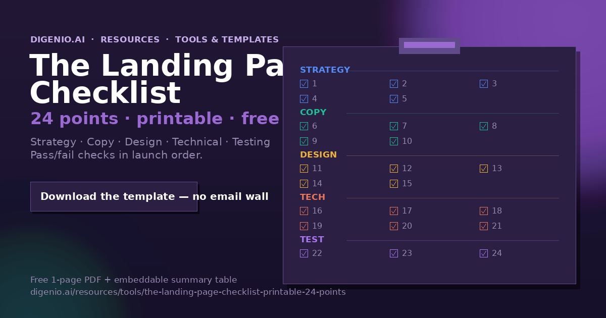
This landing page checklist fixes that. It's 24 points covering strategy, copy, design, technical setup, and testing — in the order you'd actually build and launch a page. Each point is a yes/no question you can answer in under a minute. Print it, pin it, and run it before every launch. You can also download the free template below and, if you use Digenio, let the dashboards answer the measurement points for you automatically.

What this tool/template does

The checklist turns "we think the page is good" into "the page passes 24 specific tests." It works in three ways:

1. Pre-build
Use the Strategy section (points 1–5) as a brief before anyone writes copy or opens a design tool
2. Pre-launch
Run all 24 points as a gate the page must pass before it goes live
3. Audit
Score an existing page: anything unchecked is your prioritised to-do list

It deliberately avoids advice that requires judgement calls ("make it compelling!") in favour of checks with a clear pass/fail. Where a point needs depth, it links to the full guide in our landing page optimization guide.

The landing page checklist at a glance

All 24 points on one screen — the same table that ships in the printable template and the embeddable version. Five sections, in launch order:

Section Points What every check has in common
1. Strategy 1–5 One goal, one audience, one source, one metric — and a look at the rival pages.
2. Copy 6–10 Offer-first headline, outcome subhead, proof, one CTA, objections answered.
3. Design 11–15 Hierarchy to the CTA, form friction matched to value, mobile-first, message match, credibility.
4. Technical 16–21 Speed, verified tracking, confirmation page, UTMs, tested forms, accessibility.
5. Testing 22–24 A second pair of eyes, a test queued, a 30-day review on the calendar.

If you only ever enforce five points, enforce 1, 4, 6, 16, and 17 — one measurable goal, a target number, an offer-first headline, sub-3-second load, and tracking that provably fires.

How to use it (step by step)

Step 1 — Lock the strategy (points 1–5)

Answer these before anything else, in writing:

  1. One page, one goal. Can you state what this page's single conversion action is in one sentence? (Form fill, booking, trial start — pick one.)
  2. One audience. Is the page written for exactly one segment/persona, not "everyone who might care"?
  3. One traffic source. Do you know where visitors come from (ad, email, organic) — and does the message match that source's promise?
  4. One primary metric. Have you defined the conversion event and a target number before launch, so success is measurable?
  5. One competitor reality-check. Have you looked at the 2–3 pages you're actually competing with on SERPs/ad auctions, and can say what you do differently?

Step 2 — Write the copy (points 6–10)

  1. Headline = the offer, not the brand. Does the H1 state what the visitor gets in plain words? (For search-driven pages, the primary keyword belongs here too — see SEO for landing pages.)
  2. Subhead answers "so what?" Does the first paragraph explain the outcome for the visitor, not the company?
  3. Proof within one scroll. Is there at least one specific, verifiable proof point (number, logo, named result) visible without scrolling past the fold?
  4. One CTA, repeated. Is there a single call-to-action verb, used consistently, repeated 2–3 times down the page for scrollers?
  5. Objection handling. Does the copy answer the top 2–3 obvious objections (price, time, trust, "is this for companies like mine")?

Step 3 — Design the page (points 11–15)

  1. Visual hierarchy leads to the CTA. Does the most eye-catching element on every screen section point toward the action?
  2. Form friction matches offer value. Does the form ask only for what you'll actually use at this stage? (Every extra field is a toll — see our lead scoring calculator for what to do with the data you do collect, and the Nielsen Norman Group's web form design research for the UX evidence.)
  3. Mobile-first check. Have you viewed the page on a real phone — thumb-reach for the CTA, readable font sizes, no horizontal scroll?
  4. Consistent message match. Do the ad/email and the page look and sound like the same promise? (Mismatch is the #1 paid-traffic conversion killer.)
  5. Credibility signals present. Testimonials, certifications, guarantees, or a real human/company identity — at least two, placed near the conversion point.

Step 4 — Handle the technical setup (points 16–21)

  1. Page speed. Does it load in under ~3 seconds on a mid-range phone? (Test with Google's PageSpeed tools; see outbound links.)
  2. Tracking fires correctly. Has someone actually submitted the form on the live page and seen the event land in analytics — not just "the tag says installed"?
  3. Thank-you page and confirmation. After conversion, does the visitor get a clear confirmation and a next step (not a dead end)?
  4. UTMs and attribution. Do inbound campaign links carry consistent UTM parameters, so you'll know which source produced the conversions? (Our free UTM builder keeps these consistent.)
  5. Working forms, tested end-to-end. Has the form's notification, CRM sync, and autoresponder each been verified with a real test submission?
  6. Accessibility basics. Are images alt-tagged, contrast readable, form labels present, and the page keyboard-navigable?

Step 5 — Launch and test (points 22–24)

  1. A pre-launch 24-point pass. Has someone other than the page's author run this full checklist? (Authors are blind to their own pages.)
  2. A test queued from day one. Is there a specific A/B test scheduled for the weakest point? (Start with the headline — see A/B testing landing pages.)
  3. A review date on the calendar. Is a 30-day data review scheduled — conversion rate vs. target from point 4, and a decision: iterate, scale, or kill?

Worked example with real numbers

A B2B SaaS team launched a demo-request page for a logistics product. First version: generic headline ("Leading Logistics Platform"), 9-field form, one testimonial below the fold. Result: 1.4% conversion on ~700 paid visits in two weeks — about 10 leads at a blended cost no one wanted to calculate.

Running the checklist found six failures: point 1 (page tried to serve both demo requests and newsletter signups), point 6 (headline described the company, not the outcome), point 9 (two competing CTAs), point 12 (9 fields including "company website" — obtainable elsewhere), point 14 (ad promised "cut dispatch errors," page never mentioned dispatch), and point 22 (no one had reviewed it).

Fixes: one goal (book a demo), headline "Cut dispatch errors by a third without replacing your TMS", 4 fields, message-matched ad copy, testimonial moved above the fold. Second version: 4.1% conversion on the same traffic profile over the next two weeks — roughly 3× the leads at identical ad spend. No design overhaul, no new traffic: just six checklist points enforced. (Numbers from a Digenio pilot engagement, shared with permission; your baseline will vary — measure your own with the point-4 target.)
The methodology behind the checklist

The 24 points come from three sources, cross-checked against landing page best practices at time of writing (Oct 2026):

The ordering matters: strategy points catch expensive errors while they're still free to fix; technical points catch silent failures (unfired tracking, broken notifications) that corrupt every conclusion you'd otherwise draw; testing points stop the page from being judged by opinion instead of data. If you only ever enforce five points, enforce 1, 4, 6, 16, and 17.

Download the template + FAQ

Download the printable checklist (free) — a clean 1-page PDF of all 24 points with tick-boxes, colour-coded by section. Ungated: no email required, ever.

Point 24 of the sheet includes the Digenio trial link, so the template travels with you.

Embed this checklist on your site

Copy the embed snippet below to share the checklist with your audience (it renders as the summary table):

<iframe src="https://digenio.ai/resources/tools/the-landing-page-checklist-printable-24-points/?embed=1#summary" title="Landing Page Checklist — 24 Points" width="100%" height="640" loading="lazy"></iframe>

You're welcome to embed it free; please keep attribution and the source link. The ?embed=1 parameter strips the site chrome for a clean iframe — same mechanism as our lead scoring calculator.

How Digenio automates this: points 4, 17, 19, and 24 stop being chores when dashboards track conversion against target from day one, Form Intelligence verifies and enriches every submission, and the 30-day review (point 24) is a report, not a spreadsheet archaeology session.

See Digenio automate the checklist

Start your free trial — 14 days, no card charge. The measurement points answer themselves.

Start your free 14-day trial → No card required

FAQ

A landing page checklist is a fixed list of pass/fail checks — covering strategy, copy, design, technical setup, and testing — that a page must pass before launch. This one has 24 points, printable as a one-page PDF or Google Sheet.

Yes. The printable template is ungated — no email required. The embed version is free to use on your own site with attribution.

Both. Run points 1–21 as a pre-launch gate, then all 24 (including the review check) on existing pages as an audit to build a prioritised fix list.

Enough to cover the five stages without becoming a document nobody finishes. We use 24 because it fits on one printable page and maps 1:1 to a section: strategy (1–5), copy (6–10), design (11–15), technical (16–21), testing (22–24).

In our audits: no single measurable goal, headline about the company instead of the outcome, forms asking for more than the offer justifies, message mismatch between ad and page, and tracking that was never verified end-to-end. Points 1, 6, 12, 14, and 17 exist because of these.

Yes — it was built with paid traffic in mind. Points 3 and 14 (message match) are the ones that matter most for ad traffic; a mismatched promise between ad and page is the most common paid-campaign conversion killer.

Next read: Landing Page Optimization Guide · Landing Page Anatomy · A/B Testing Landing Pages

Editorial plan II (Oct–Dec 2026) · The Landing Page Checklist (Printable, 24 Points) · Rex Farrow 2026-10-26 · page built by Lux